Entrepreneur Accounting App

This case study explores the receipt capture feature and how to easily link receipts to client accounts for invoicing and also to bank transactions for seamless end-of-year accounting purposes.

bank: Several mobile phones laid out; highlighting the different pages of the bank app.

My Role

UX Designer

The Team

1x UX Designer

Duration

3 weeks

Tools Used

Figma
Photoshop

My Key Contributions

Brand Creation
Competitive Research
Concept Ideation
Interactions
Prototyping
User Research

My Role

UX Designer

Duration

3 weeks

The Team

1x UX Designer

Tools Used

Figma
Photoshop

My Key Contributions

Brand Creation
Competitive Research
Concept Ideation
Iconography
Interactions
Prototyping
User Research

The Challenge

How might we create an app that allows entrepreneurs to run their business remotely?

Learning About the Users

Interviews/Empathy Maps/Pain Points

the Interview Transcripts

I first needed to know what accounting apps these entrepreneurs were currently using and if they were experiencing pain points with them.

I also wanted to know what other apps they used in the past and what about those apps made them switch to their current app.

Lastly, I needed to know what features I had to focus on so as to get them to switch over to my app.

I started to understand my user’s thoughts and feelings towards their current accounting situation.

Empathy maps gave me the initial insights needed to begin pinpointing the user’s pain points.

Understanding the User

Personas

This was the perfect opportunity to look at the goals, characteristics and needs of the larger user groups.

I needed to identify patterns in their behaviour that might further point to common pain points that my interviewees experienced.

Putting a Finger on it

Problem/Hypothesis Statement

Determining the problems of my users allowed me to put my full focus into resolving their most pressing pain points.

Set the Bar

Value Propositions

✔️ Modern customizable estimate/invoice templates that reflects your brand.
✔️ Quickly snap photos of your receipts and get back to them later.
✔️ Easily invoice clients with receipt renderings attached.
✔️ Save money in accounting fees with our receipt filing system.
✔️ A stress-free time tracker to validate the energy you put into your projects.
✔️ Get paid fast! Clients can pay directly from your emailed invoice.

Learning About the Competition

Competitive Audit

Analyzing competitors gave me a well-rounded foundation of knowledge about the accounting app market. It helped me create a product that was helpful and unique which added value for users.

The insights gathered here carried over to my designs.

Follow the Yellow Brick Road

User Flow

This receipt onboarding user flow allowed me to foresee the user’s happy path. 

It helped me determine:
✔️ What actions the users would take in the app.
✔️ What decisions they would have to make.
✔️ What screens they would experience after taking action or making a decision.

Putting Pen to Paper

Paper to Digital Wireframes

Validating the Work

Testing Prep

I asked myself these key questions and set out to find the answers:
✔️ How long does it take for the user to snap a photo of their receipt and attach it to their transaction?
✔️ Are there parts of the user flow where users get stuck?
Are there design changes I can make to improve the user experience?
✔️ Is there anything that users want to see added to this feature?
✔️ Are there any reasons why users wouldn’t use this feature?

How did it Go?

Usability Test

One of the KPIs that I set out to test was time on task. Initially, users took 3m05s on average, to snap and onboard a receipt. That was compared to 19s after three iterations; an average decrease of 3m46.

After running my usability test I realized that IF the user didn’t give up that it would take them, on average, 3m5s to complete the test of snapping a receipt and linking it to their transaction.

After running my third usability test, all users were able to complete the test of snapping a receipt and linking it to their transaction in record time! Users could do this in 19s, on average.

Building Upon What was Learned

Iterations

Pending Transactions Iterations

HOVER OVER THE HOTSPOTS FOR DETAILED INFORMATION

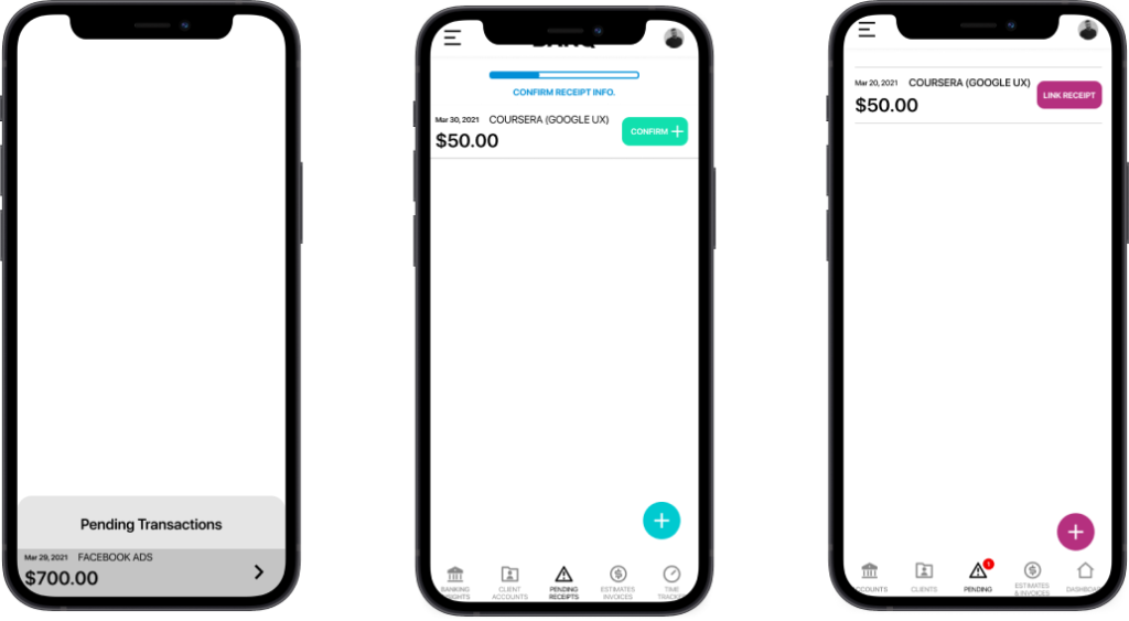
All 5 participants didn’t know where they were in the app and weren’t sure how to proceed.

1 of 5

A “Pending Receipts” area was added to the app to help users understand where they were in the app.


2 of 5 participants clicked the “Pending Receipts” icon, thinking they would navigate away from the current page.

2 of 5

I added a bright green “Confirm” button and a progress bar in the top navigation with instructions.


3 of 5 participants found the “confirm” button wasn’t a clear enough call to action.

3 of 5

By changing the button copy to “Link Receipt,” all participants were clear about the intention of the button.

4 of 5

By adding a notification dot above the “Pending” tab, all users were confident of where they were in the app.

5 of 5

This section of the receipt onboarding process was the biggest usability problem that I encountered during testing.

Receipt Onboarding Iterations

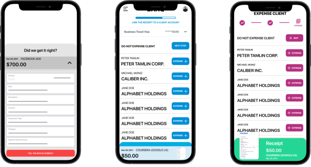
Initially, connecting a receipt to a client’s account could only be done once onboarding was complete.


The user would have to go to the particular transaction, click “more details,” and edit the field with the list of active client accounts.

1 of 9

4 of 5 participants commented that the colours of these onboarding buttons were the same as the buttons in the transactions area, which made it confusing to them.

2 of 9

2 of 5 users clicked “Next Step” thinking that it was what they needed to press in order to proceed.

3 of 9

All participants failed to read the instructions under the progress bar.


Several participants clicked all over the screen instead of reading the top navigation instructions.

4 of 9

3 of 5 participants clicked this receipt overlay several times which took them to a receipt preview screen.


Users didn’t realize the overlay represented the receipt.

5 of 9

A custom navigation bar with icons and copy reinforced the action that needed to be taken.

6 of 9

The colour of the buttons were changed to a brighter colour to make them more obvious as the next step.

7 of 9

None of the participants clicked this button after the button copy was changed to ‘Skip.”

8 of 9

The receipt overlay was made more obvious and was titled “Receipt.”


All participants understood that the overlay represented the receipt.

9 of 9

The onboarding process was tricky, but I managed to get running smoothly.

How do I Look?

Brand Identity

the asset library for BANK app

For Here or To Go?

Take Away

As a small business owner myself, this project resonated with me. Finding an app that allows you to easily send out estimates/invoices and processing receipts in a way that allows you to i. Chargeback clients for the items needed for their project, ii. Seamless file them in the cloud for your business’ accountant at the end of the fiscal year. 

The business owners that I interviewed told me that thousands of their hard-earned dollars were lost because of misplaced receipts or completely forgetting to charge their clients for everything that was used during projects. Also, the price of processing business taxes is absurd. By having all the receipts and business statistics populated in one place, accountants will spend less time processing the information and therefore drastically reducing the costs to these young entrepreneurs. 

Although it took several iterations to this case study, I’m confident that small business owners can navigate this app; allowing them to rest assured that their hard work is actually paying off.

Skip to content