Pre-Owned Car Reseller Website
This case study explores the purchase flow of a pre-owned car website. It allows you to trade in your current car; get an extended warranty; helps with financing and provides car insurance quotes that seamlessly connects you to your selected insurance provider.

My Role
UX Designer
The Team
1x UX Designer
Duration
2 weeks
Tools Used
Adobe XD
Photoshop
Jamboard
Google Sheets
Google Docs
My Key Contributions
Brand Creation
Competitive Research
Concept Ideation
Iconography
Interactions
Prototyping
User Research
My Role
UX Designer
Duration
3 weeks
The Team
1x UX Designer
Tools Used
Adobe XD
Photoshop
Jamboard
Google Sheets
Google Docs
My Key Contributions
Brand Creation
Competitive Research
Concept Ideation
Iconography
Interactions
Prototyping
User Research
The Challenge
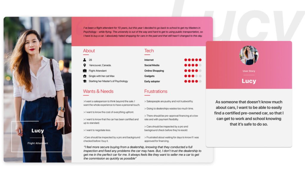
How might we create a one-stop-shop website that takes all the stress out of buying a used car?
Learning About the Users
Interviews/Empathy Maps/Pain Points
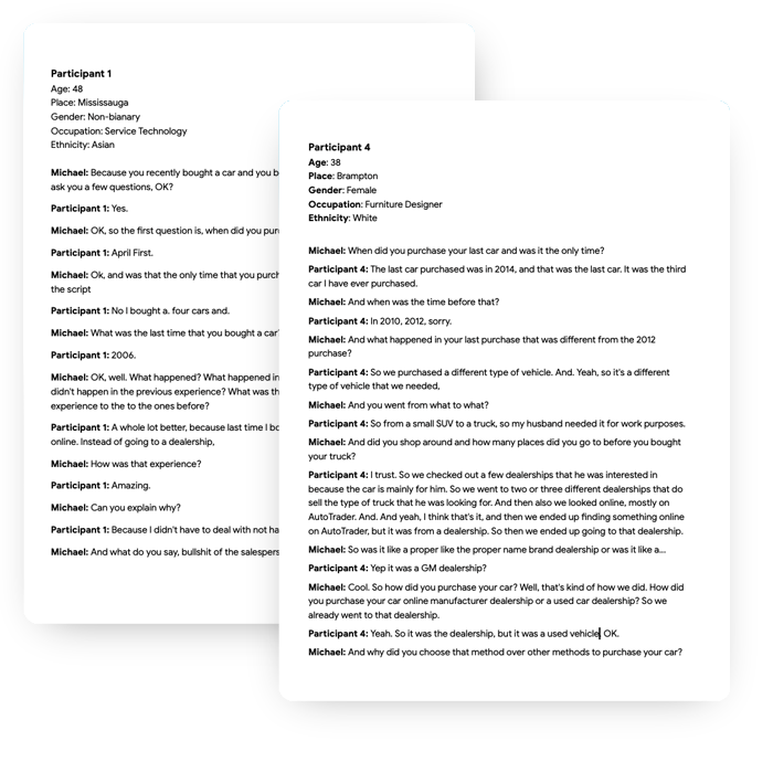
I first needed to know when the interviewees bought their last vehicle and what their experiences were like. I wanted to know if they experienced any pain points throughout their car search, car buying, car selling, financing, or insurance processes.
I then wanted to find out what they would change about each step along their journey of buying a new or used car.
Set the Bar
Goal Statement
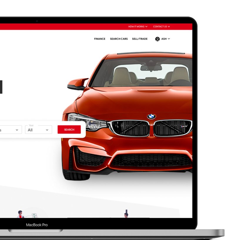

My website will let users sell or trade-in their car, buy a preowned car, purchase extended warranty & car insurance, and get financing which will affect those who don’t have a lot of free time or knowledge about cars by providing them with full transparency and by providing all the information they need to make a fully informed decision.
I will measure the effectiveness by the number of sales recorded vs. the number of cars that have been returned after the 7-day trial.
Follow the Yellow Brick Road
User Flow
This user flow allowed me to foresee the user’s happy path throughout the car buying process.
It helped me determine:
✔️ What actions the users would take in the app.
✔️ What decisions they would have to make.
✔️ What screens they would experience after taking action or making a decision.
Putting Pen to Paper
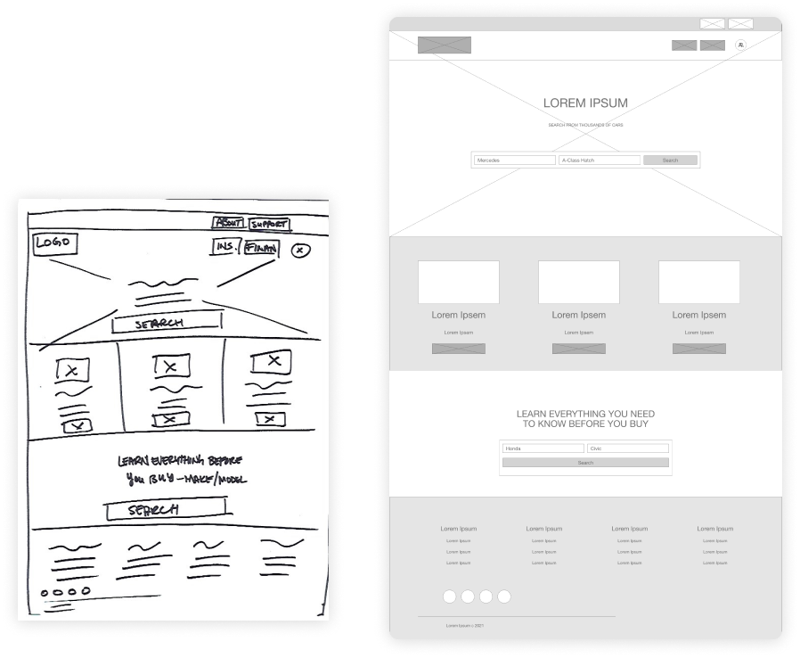
Paper to Digital Wireframes

Validating the Work
Research Study
I asked myself these key questions and set out to find the answers:
✔️ How long does it take for the user to snap a photo of their receipt and attach it to their transaction?
✔️ Are there parts of the user flow where users get stuck?
Are there design changes I can make to improve the user experience?
✔️ Is there anything that users want to see added to this feature?
✔️ Are there any reasons why users wouldn’t use this feature?
How did it Go?
Usability Test
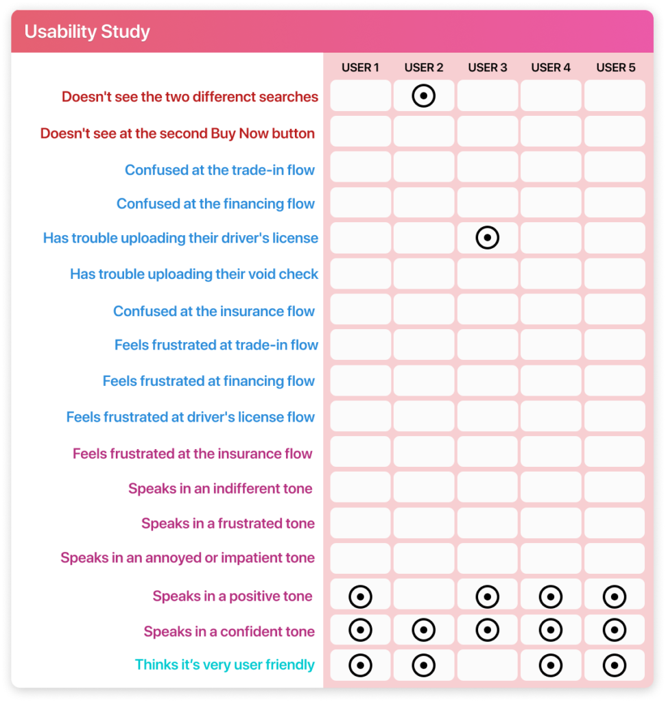
One of the KPIs that I set out to test was: system usability scale. I asked participants several questions centred around ease of use, learning curve, consistency, and lastly about their confidence throughout the car buying process.
Results
Ease of use: All participants agreed it was easy to use. 50% of them thought it was really easy to use.
Learning curve: All participants agreed that there wasn’t a steep learning curve. 60% strongly agreed with that statement.
Consistency: 80% of participants believed the website was consistent throughout their interaction. Of those participants, 50% strongly agreed. Whereas, 20% disagreed.
Confidence of use: 80% of participants stated that they were confident going through the purchase flow. 20% were neutral.
Results
Ease of use: All participants agreed it was easy to use. 60% of them thought it was really easy to use. An increase of 10%.
Learning curve: All participants agreed that there wasn’t a steep learning curve. 80% strongly agreed with that statement. An increase of 20%.
Consistency: All participants believed the website was consistent throughout their interaction. 30% strongly agreed. 20% downgraded to “agree,” whereas 30% upgraded to “agree.”
Confidence of use: 90% of participants stated that they were confident going through the purchase flow. 10% remained neutral.
Building Upon What was Learned
Iterations
Purchasing Flow
HOVER OVER THE HOTSPOTS FOR DETAILED INFORMATION

3 of 5 participants thought the sequence flow was out of order.
1 of 61 of 5 participants didn’t see the price of the car live updating in the nav. throughout the process.
They believed that the total price should be listed in the “Review Order” page.
2 of 61 of 5 participants didn’t see the “Confirm Button” below the fold and believed there should be a button at the top.
3 of 6Sequence adjusted.
4 of 6Purchase total added.
5 of 6Confirm button added.
6 of 6Receipt Onboarding Iterations

1 of 5 participants mentioned that they were confused because three forms indicated “1 of 3,” but with different information in each form.
1 of 7Also indicates form 1 of 3.
2 of 7Also indicates form 1 of 3.
3 of 72 of 5 participants indicated that the form navigation was bulky and distracting.
4 of 7Form 1 remained the same as the original.
5 of 7The original forms 2 & 3 were amalgamated into this one form.
6 of 7A more streamlined navigation allowed participants to see where they were in the flow and seen all in one place.
7 of 7Buttons & Input Fields

1 of 5 participants mentioned that the “Select File” button was too neutral and blended in too much.
1 of 6The button colour was changed to the secondary colour.
2 of 61 of 5 participants indicated that the selection buttons was too similar to the confirmation button.
3 of 61 of 5 participants indicated that the the options listed were very limiting.
4 of 6The colour of all the selection buttons were changed to the secondary colour.
5 of 6An “other” checkbox was added with an input field.
6 of 6How do I Look?
Brand Identity

For Here or To Go?
Take Away
Before starting this project I knew absolutely nothing about the car buying experience. But throughout the interview process, I quickly realized that buying a car is a frustrating and shady business. From trying to sell you rust protection without having a standardized price list so they can recuperate the money lost during negotiations to leveraging winter protection mats to pacify customers in order to make them feel like they accomplished something during the negotiation process. I heard countless horror stories that made my user experience journey for this project extremely easy to navigate.
The major pain points were selling their car at a fair price, buying a car from aggressive salespeople, and financing that didn’t break the bank. When conducting my usability testing I heard several people say “too bad this site doesn’t really exist!” There’s definitely a demand for this kind of car-buying experience in Canada.

