CPR & Choking App

This case study explores the mobile learning flow of a CPR/choking course and the Google Assistant functionality that gets unlocked with the successful completion of the course.

Revive: A phone displaying the Revive app logo with text next to it that reads "unlock the power of CPR and your google assistant."

My Role

UX Designer

The Team

1x UX Designer

Duration

2 weeks

Tools Used

Figma
Photoshop
Jamboard
Google Sheets
Google Docs

My Key Contributions

Brand Creation
Competitive Research
Concept Ideation
Iconography
Interactions
Prototyping
User Research

My Role

UX Designer

Duration

3 weeks

The Team

1x UX Designer

Tools Used

Figma
Photoshop
Jamboard
Google Sheets
Google Docs

My Key Contributions

Brand Creation
Competitive Research
Concept Ideation
Iconography
Interactions
Prototyping
User Research

The Challenge

How might we get more people trained in CPR & choking emergencies and provide support in the event that an emergency happens?

Learning About the Users

Interviews/Empathy Maps/Pain Points

interview transcripts

I decided that it was important to interview people who have taken a CPR/first aid course in the past to see what their pain points were.

Next, I wanted to find out how they would personally change the way they were taught to minimize or eliminate those pain points.

Lastly, I wanted to get their feedback on what features a phone app should have to reduce stress and build their confidence in an emergency was to arise.


I started to understand my user’s thoughts and feelings towards their current accounting situation.

Empathy maps gave me the initial insights needed to begin pinpointing the user’s pain points.

Understanding the User

Personas

This was the perfect opportunity to look at the goals, characteristics and needs of the larger user groups.

I needed to identify patterns in their behaviour that might further point to common pain points that my interviewees experienced.

Putting a Finger on it

Problem Statement

Determining the problems of my users allowed me to put my full focus into resolving their most pressing pain points.

Set the Bar

Goal Statement

a mobile phone with the signup screen

My Revive app will let users learn CPR which will affect casualties who are unconscious and not breathing by giving people the skills needed to resuscitate them or until EMS arrives.

I will measure effectiveness by the number of people who complete the course.

Learning About the Competition

Competitive Audit

Analyzing competitors gave me a well-rounded foundation of knowledge about the accounting app market. It helped me create a product that was helpful and unique which added value for users.

The insights gathered here carried over to my designs.

Follow the Yellow Brick Road

User Flow

This user flow allowed me to foresee the user’s happy path throughout the car buying process. 

It helped me determine:
✔️ What actions the users would take in the app.
✔️ What decisions they would have to make.
✔️ What screens they would experience after taking action or making a decision.

From Rags to Riches

Wireframes to Mockups

Dedicated App

Responsive Mobile Landing Page

Progressive Enhancement Approach

Validating the Work

Research Study

I asked myself these key questions and set out to find the answers:
✔️ How long does it take for the user to snap a photo of their receipt and attach it to their transaction?
✔️ Are there parts of the user flow where users get stuck?
Are there design changes I can make to improve the user experience?
✔️ Is there anything that users want to see added to this feature?
✔️ Are there any reasons why users wouldn’t use this feature?

How did it Go?

Usability Test

One of the KPIs that I set out to test was: system usability scale. I asked participants several questions centred around ease of use, learning curve, consistency, and lastly about their confidence throughout the app.

Results
Ease of use: 40% of the participants disagreed, 27% agreed, and 33% strongly agreed that it was easy to use.

Usefulness: 40% strongly agreed, 50%, agreed, and 10% disagreed that there was a steep learning curve.

Learning curve (Google Assistant): All participants believed that there wasn’t a learning curve with the Google Assistant feature. 27% strongly agreed while 73% just agreed.

Learning curve (Course Dashboard): There was a mixed opinion about the learning curve for the course dashboard. 33% strongly agreed that there was a steep learning curve, 27% agreed, while 40% disagreed.

Results
Ease of use: All participants thought the feature was easy to use. 80% strongly agreed and 20% agreed.


Usefulness
: 80% strongly agreed, 10%, agreed, and 10% disagreed that there was a steep learning curve.

Learning curve (Google Assistant): All participants believed that there wasn’t a learning curve with the Google Assistant feature. 80% strongly agreed while 20% just agreed.

Learning curve (Course Dashboard): All participants believed that there wasn’t a learning curve with the Google Assistant feature. 80% strongly agreed while 20% just agreed.


Building Upon What was Learned

Iterations

Course Dashboard

HOVER OVER THE HOTSPOTS FOR DETAILED INFORMATION

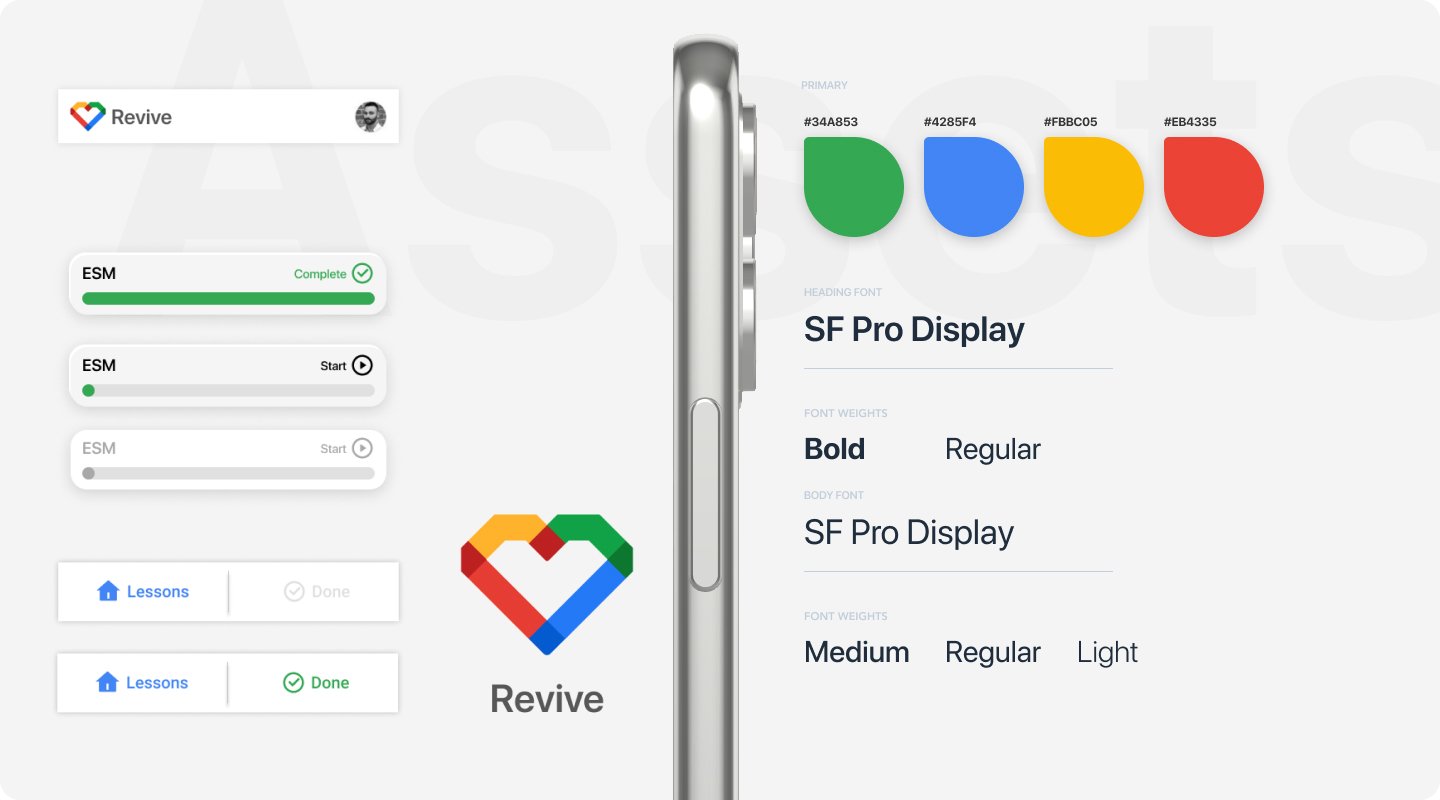
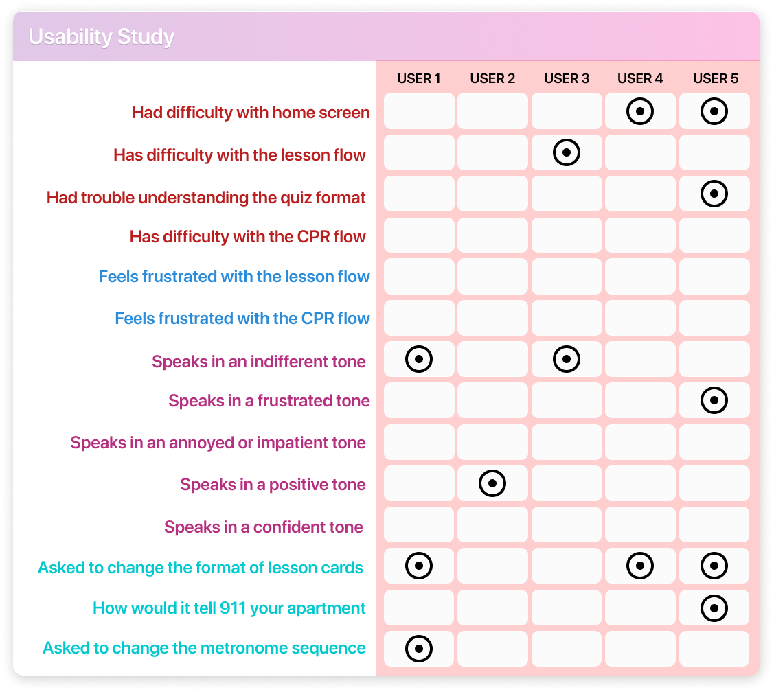
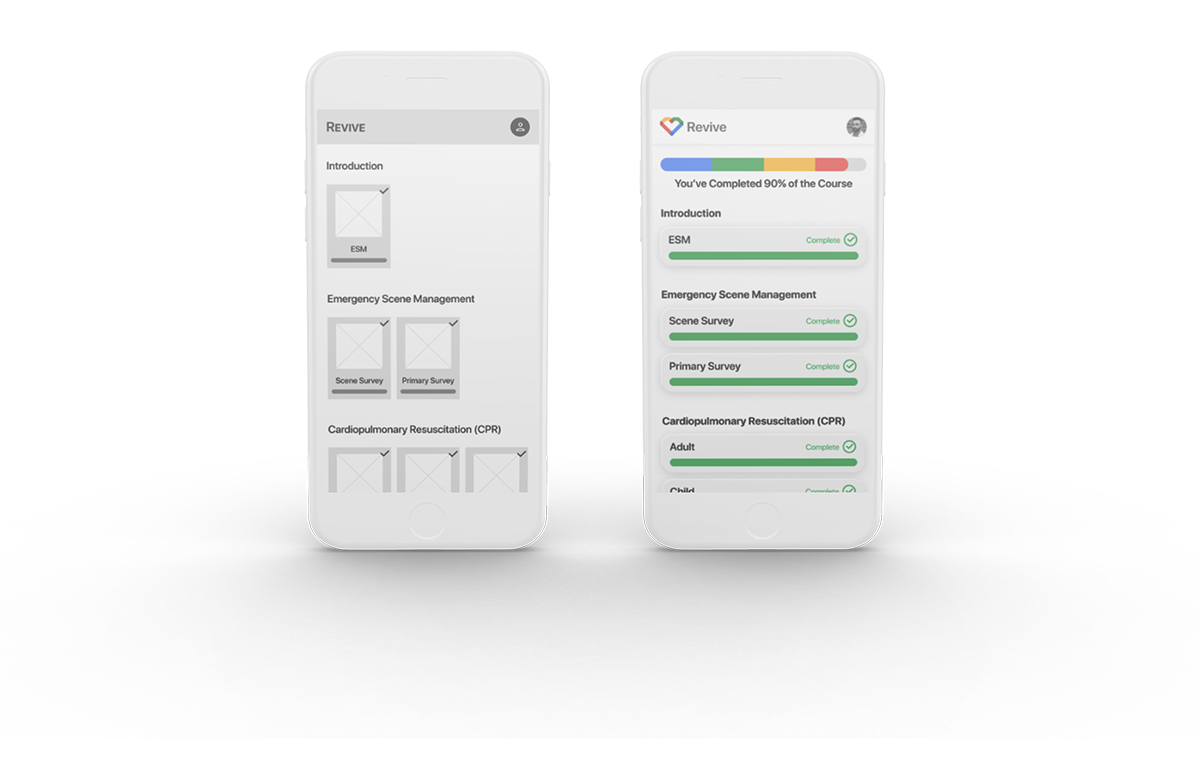
3 of 5 participants wanted to change the style of the card.

1 of 6

2 of 5 participants didn’t understand that line at the bottom was a lesson progress bar.

2 of 6

1 of 5 identified didn’t understand that the checkmark represented “complete.”

3 of 6

1 of 5 participant indicated that they wanted a progress bar at the top.

4 of 6

Cards were changed and “Complete” was added next to the checkmark to confirm lesson completion.

5 of 6

A progress bar was added to the top.

6 of 6

Lesson Flow

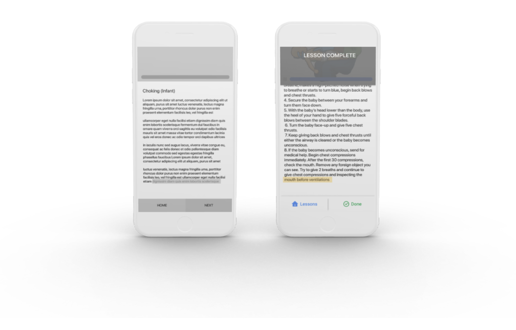
2 of 5 participants struggled with next button. They didn’t know how to proceed.

1 of 3

Text was changed to “Done” to indicate that the lesson had been completed.

2 of 3

“Lesson Complete” was overlayed on top of the video player as double confirmation.

3 of 3

Buttons & Input Fields

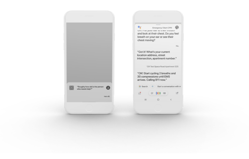
1 of 5 participants indicated that they would need confirmation at each interaction with the Google Assistant so that they know she understood and recorded the information.

1 of 4

1 of 5 participants asked how the Google Assistant would know what apartment you were in.

2 of 4

I added “Got it!” and “OK!” to indicate that the assistant understood.

3 of 4

I added an extra step in the Google Assistant flow that requested an address/apartment number or street intersection.

4 of 4

How do I Look?

Brand Identity

For Here or To Go?

Take Away

As a former lifeguard/swim instructor/CPR & first aid instructor, I know how important this app would be if it was actually created – especially if Google was to take it up as one of their projects. There would definitely be more interest in learning the information that arms them with the necessary tools to save lives.

In a big city, EMS can show up within minutes, but in other parts of the country, it could take 10x as long for EMS to show up. Remember, it only takes 4 minutes for the oxygen-starved brain to start dying which makes it harder for medical professionals to resuscitate casualties once they’re in the back of an EMS truck.

Skip to content